Showing posts with label Rives Light paper. Show all posts

Friday, January 22, 2021

Winter Shore, Wells, Maine Block Print

 In my last post, I started demonstrating the process of making a reduction block print of a winter beach scene. I've been working pretty steadily on this print, and I'll take you through from start to finish. 

This was the beginning stage of the whole process. The image was transferred from the tracing paper drawing onto the Soft-Kut block, and outlined with a Sharpie marker. 


I prepared for the printing of the ink layers by creating a cardboard template that the block would rest in securely. I attached metal "pins" to the template for accurate registration. I cut Rives Light paper into the size I needed, and taped plastic tabs onto each sheet. I also numbered the sheets at this point. This will be an edition of 15 prints.


I decided to do a blue blend layer first that would only be inked in the sky area.


I used Akua Intaglio ink (works great on relief prints as well as intaglio etchings)


This is the first layer hanging up to dry.


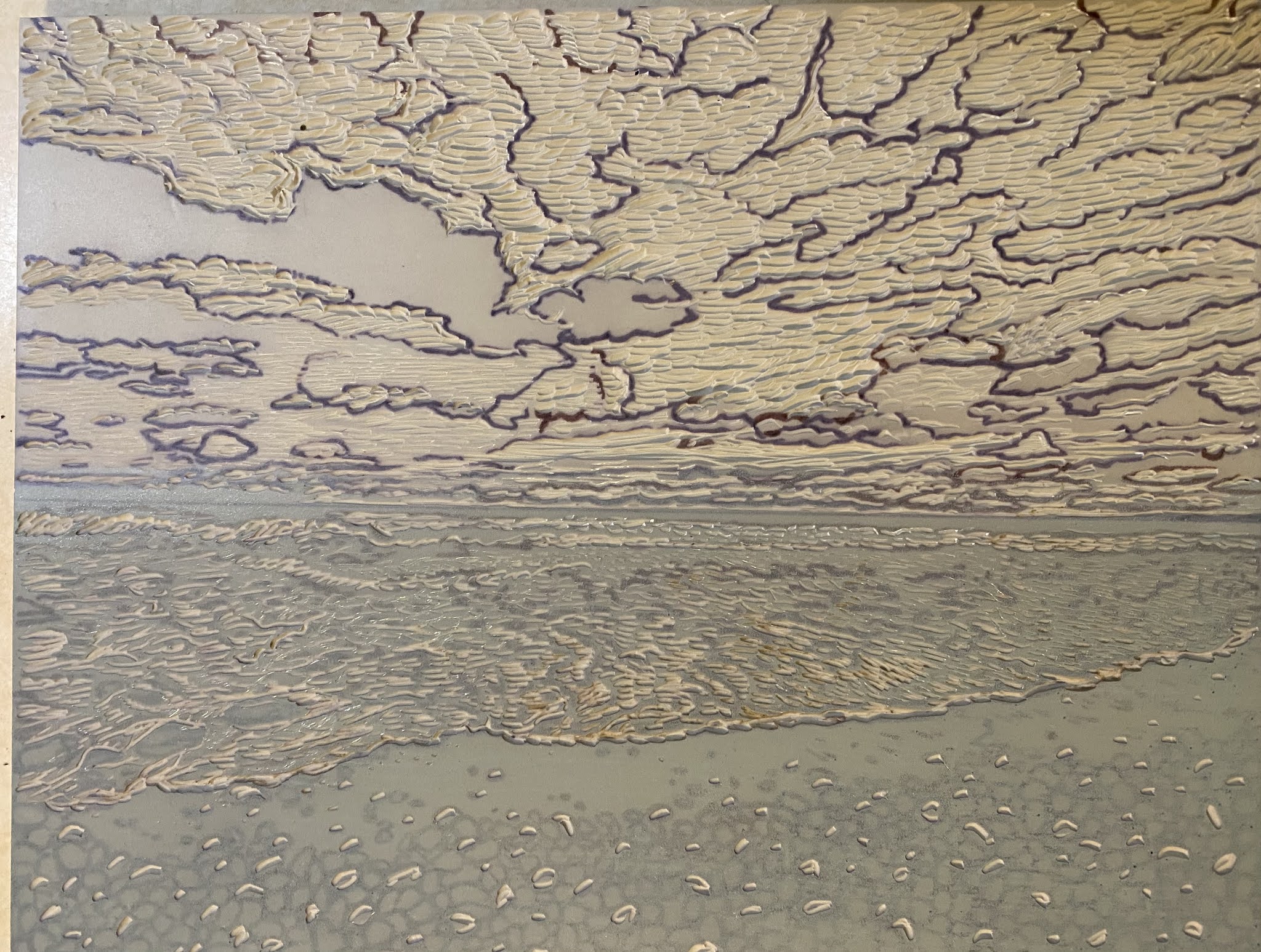
A light gray layer is printed over the whole block. I ended up printing an even lighter gray blend over the first one, as I wanted more depth in the clouds, and more variety in the gray values in the clouds.


Some definition in the clouds is beginning to appear. If you look closely you can see different gray values.

The next layer is brown for the rock layers in the foreground.


I cut away some brown areas in the rocks before the next layer.

The next layer is a greenish gray for the water and the sand.


Next is a medium gray for the rocks. 


I used masking tape to keep the ink only on the sky, in the next layer, for another gray area of the clouds. I inked the block with the tape in place, then pealed it away to print on the paper.


The image below is after one more darker gray layer in the clouds and the rocks.


At this stage I am only going to need to add a dark gray for the rocks, and a darker green/gray for the horizon area. 


The finished print!

Hopefully this gives you a better understanding of the process of reduction block printing.


Sunday, July 22, 2018

Shells Print continued....

I've been working on the "Shells" print this week, and you'll see the progress since I last posted.
The weather was so pleasant, that I was able to do some of the carving out on the porch. Wiley and I enjoy watching the birds (and squirrels) in the yard while I'm working.


In the images above, I've already printed the first color previously, and carved out the areas that will remain that first color (light gray). I'm also carving out the texture of the background. 

In the image below, here is the layer of darker gray after it has been printed over the first layer.


I've had to do a lot of carving to get the block ready for the next color.


Below are a few variations of the print with the blue-gray layer.


The ink color shows up better in this photo.


I could be done at this stage, but I think I may do another layer. I will have to wait and see how the ink dries. All the various layers of ink, affect the final color. The real trick of making a successful reduction print, is the perfect alignment of the printing paper each time you add a layer. The pins and tabs, as well as a sturdy base to hold the block in place are the keys to matching up the image every time.


Thursday, May 3, 2018

Mad River Print

I had been working on the "Mad River, Waterville Valley, NH" print for a few months, and I finally finished it. I'm happy with it now, but I wasn't feeling sure that it would come out the way I wanted. I started with some intense colors in the first layers, which I liked, but I had to make some color decisions in the middle that deviated from the actual tones in my reference photos. I got some feedback from others in my printmaking class, and I'm satisfied with the final color scheme.

Setting up for the final layer


                                                           Registering the paper
                                                                Leaving them to dry

This weekend the printmaking class is showing our work at a venue in Brookline NH!


Friday, July 31, 2015

Lobster Print

I just posted my new "lobster" print on my Etsy shop. I'm really excited about a new block printing material that I used for this project. I used a Gomuban plate that I've learned is a regular staple in Japanese classrooms. It's much softer than linoleum, but firmer than Easy-cut. It carves beautifully and can be printed using a press. Most of my other prints are printed by hand using the Easy-cut blocks, but this material is definitely something that I'm going to explore. The thickness of the Gomuban is only about an 1/8 of an inch, with blue on one side and green on the other, with a black core. The Akua inks that I used for the lobster print went onto the block nice and thin. Using a template on the press as well as pins and tabs, gave me strong color and excellent registration.


Plate on left with 2 color print stage on right


Final stage, wrapped and ready to go!

I'm also in the middle of another printing project using an Easy-cut block of a rushing stream. My daughter took the photo, but she is not sure exactly where it was taken---somewhere north of Plymouth.  It's similar to another mountain stream piece I finished recently. The Easy-cut is handy when I'm working at home without a printing press.

Feeling like summer is flying by way to quickly! So many projects, so little time!

*McClain's Printmaking Supply Catalog carries the Gomuban plates, and will send a free sample if requested.

Monday, December 29, 2014

Ball Jar Print

Now that Christmas is over, and I have a vacation from work this week, I can get organized with some of the projects that were put on the back burner! Over the last several days I've been working on a print that I started earlier in the fall. I finished the last layer today and am happy to be able to show it off.


The Ball Jar


This is the final state of the plate. I used an Soft-Cut block with layers of gray, light green, light blue, dark blue, and black. The paper is Rives Lightweight White, and the inks are Akua intaglio inks. I like those because they do not dry out while printing, and they clean easily with Dawn dishwashing detergent. The prints do take a few days to dry especially with multiple layers. These materials work well for me because I do not need to use a printing press, and I can print at home. The image size  of this design is 51/2" x 71/4". I'd like to do a series of prints using glass jars as themes. It was very challenging to try and create the illusion of transparency, but I'm pleased with the way the edition came out.


The state of the print before the dark blue and black layers were printed.


Happy New Year!

Wednesday, August 21, 2013

California Vineyards

I just finished a new block print inspired by my trip to California last month. I'm excited to be mailing off prints this week to my friends who traveled with me. I'll post the process of making a multi-colored reduction block print so anyone stopping by can understand the various steps of this technique.

Here's the "easy-cut" block with the drawing on it. I usually outline everything with a black Sharpee marker first, so all the details stand out.

I also use a template to mark each layer so they will match up when I print the subsequent colors.

Here is the first color, printed by hand, on Rives Light paper using Akua inks. 


Layer 2 is a blend of two colors that make up the sky and some of the brown background. You can see the areas that are cut away so the first color shows through.


Layer 3--- green and gray


Layer 4---more green


Final Layer--the inked plate


The finished design---"Vineyard View"


Maybe I should open up that bottle of wine I brought back from California, to celebrate!